Kit and Ace
While many people prefer to live in their spandex-cotton blend yoga pants (especially those driven inside by the COVID-19 pandemic), an off-shoot of the global athleisure behemoth Lululemon offers a comfortable, more sophisticated alternative. Kit and Ace, a Vancouver-based retailer co-created by Shannon and JJ Wilson, the wife and son of Lululemon Founder Chip Wilson, offers casual wear woven from “technical fabrics”—proprietary blends that can be worn as easily on a bike as they can in the boardroom.
Info
Type
Retail
Client
Kit and Ace
Location
Multiple
Designer
Evoke International Design in partnership with B+N Industries and Kit and Ace design team.
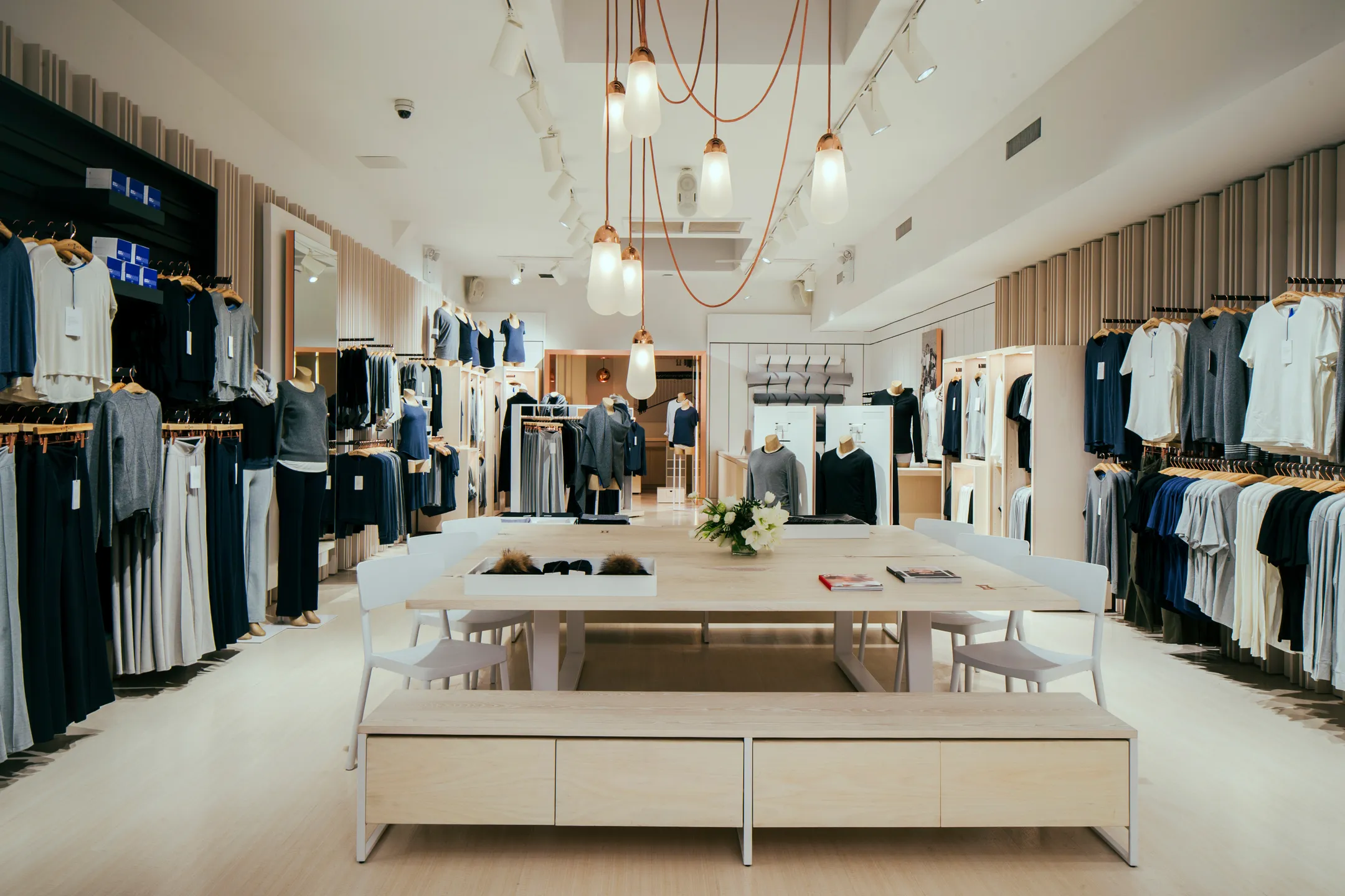
For the brand’s U.S. debut in 2015, Kit and Ace settled on a 1,851-square-foot storefront in New York City’s trendy NoLita neighborhood (the store is now closed). The store’s look was designed by Vancouver architects Evoke International Design in partnership with B+N Industries.
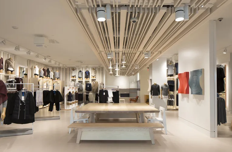
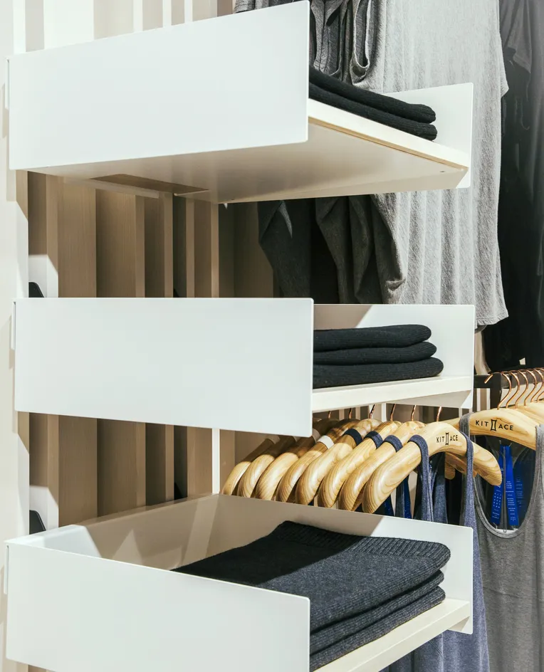
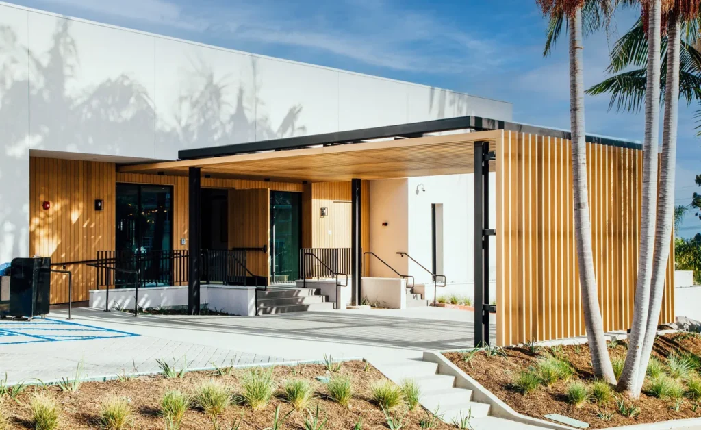
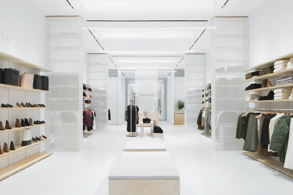
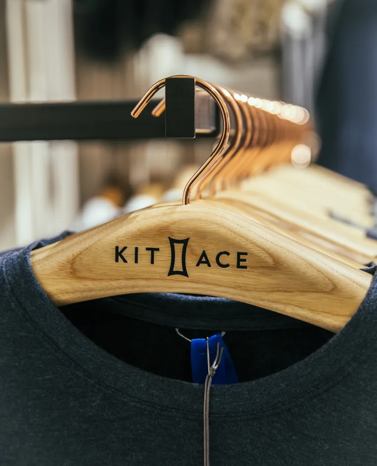
The shop exuded a relaxed yet modern vibe. Reclaimed redwood planks flanked the exterior of the store, and inside, warm white ash floors and white metal wall panels brightened the space. The simplicity was broken up by splashes of Kit and Ace’s signature blue, as well as copper accents.
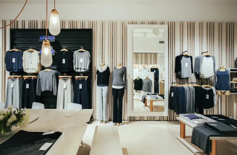
“The materials used were intended to be representative of a simple West Coast modern design aesthetic,” explained David Nicolay, principal and lead designer at Evoke, to design:retail magazine in 2015. “We started working with white ash as the material for the walls; it complements the refined nature of the clothing. The combination of stained white ash, white panels, black ‘hot walls’ and copper accents were to ensure the product had an interesting background to sit upon, but still allowed the product to be the feature of the store and not compete with its surroundings. The added touches of copper throughout the store design were to further enhance the feeling of luxury.”
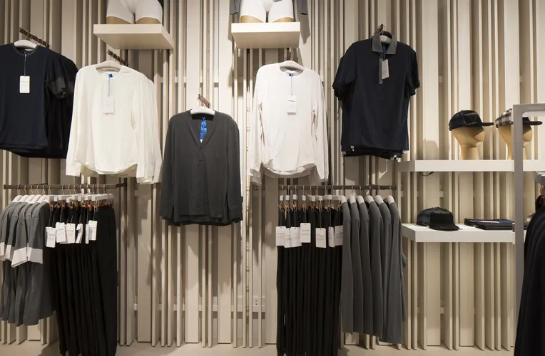
B+N provided the bulk of the fixture package, all the way to the peg hooks, which display the thread in the store’s tailor shop, an area that features an in-house trend designer who helps with monogramming and other customization services.
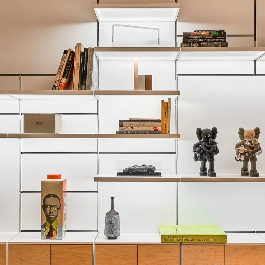
Gary Somberg, architectural representative at B+N, says the combination of the company’s 1224 and Fortina louvered upright systems was totally unique to Kit and Ace. “The perimeter walls were designed as almost a clean slate,” he explains. “You could completely redesign the interior of the store; put any face-out or any T-shirt box anywhere. It’s kind of neat how they can rearrange the stores by simply moving a wall bracket.”
