Grow Healthy
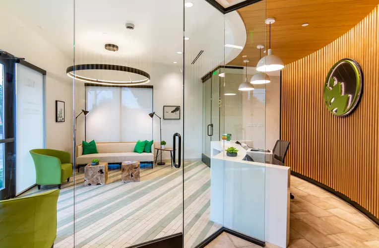
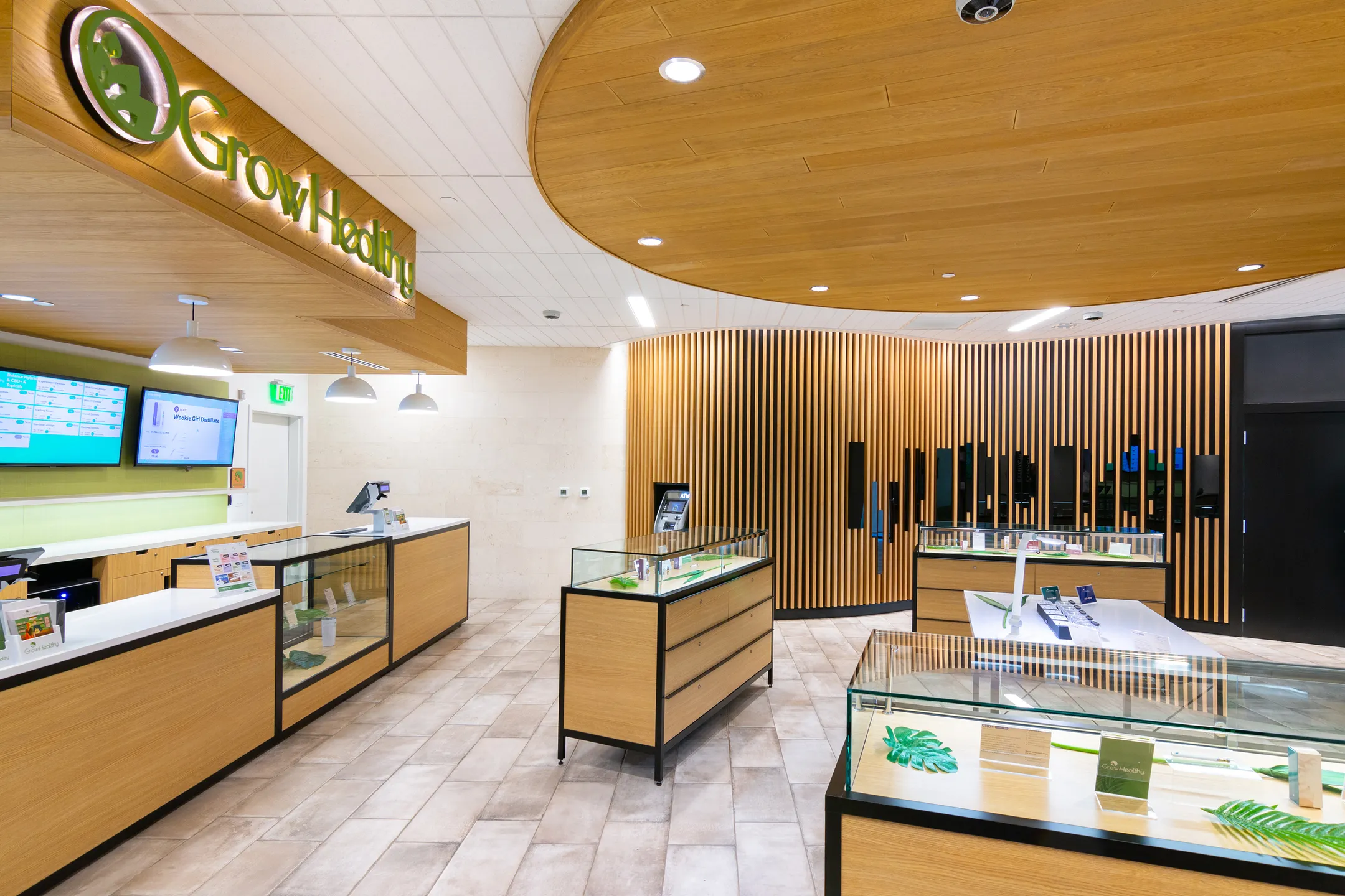
When it comes to outfitting marijuana dispensaries—a sudden and rapidly expanding entry in the national economy and the architect’s portfolio—designers can do a lot to legitimize this once-illegal pastime by taking cues from similar types of retail shops. For example, many shops in the wellness industry use well-lit and well-appointed spaces with minimalist shelving to both communicate their brand’s esteem for transparency as well as to stay on-trend. The point is to underscore that wellness and fun can be the standard, and that same message can certainly find a home in marijuana dispensaries.
Product(s) in use
Info
Type
Retail
Client
GrowHealthy
Location
Orlando FL
Designer
2+ Architects
This is the case at Grow Healthy, an Orlando-located dispensary. “Darkness and secretive layouts, so representative of the old stores, were replaced with bright and open spaces because, for a large portion of the clients, the dispensary may be their initial introduction to cannabis products that may come with stigmas or misconceptions,” says Julio Perez, a designer at 2+ Architects who worked on Grow Healthy’s design.
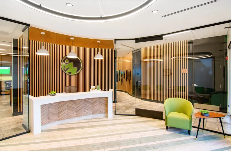
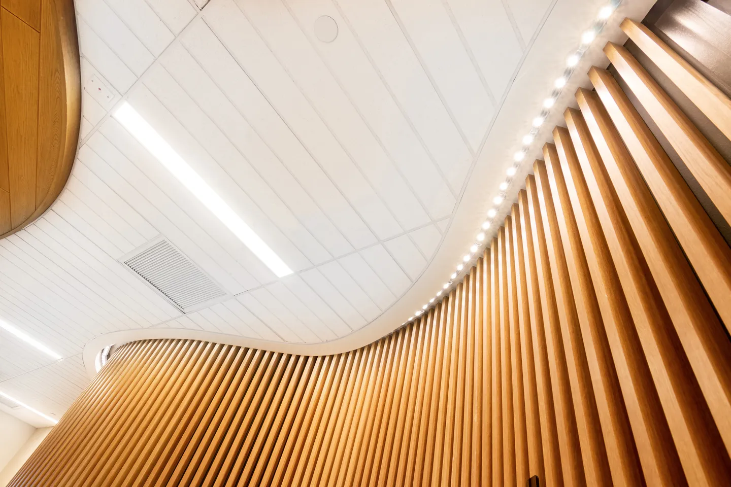
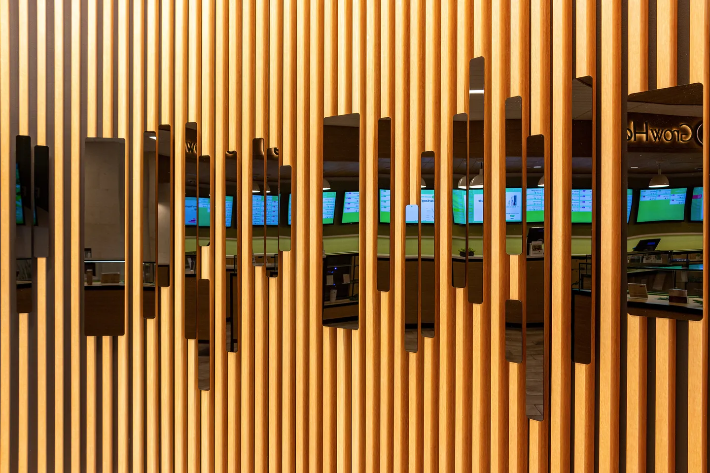
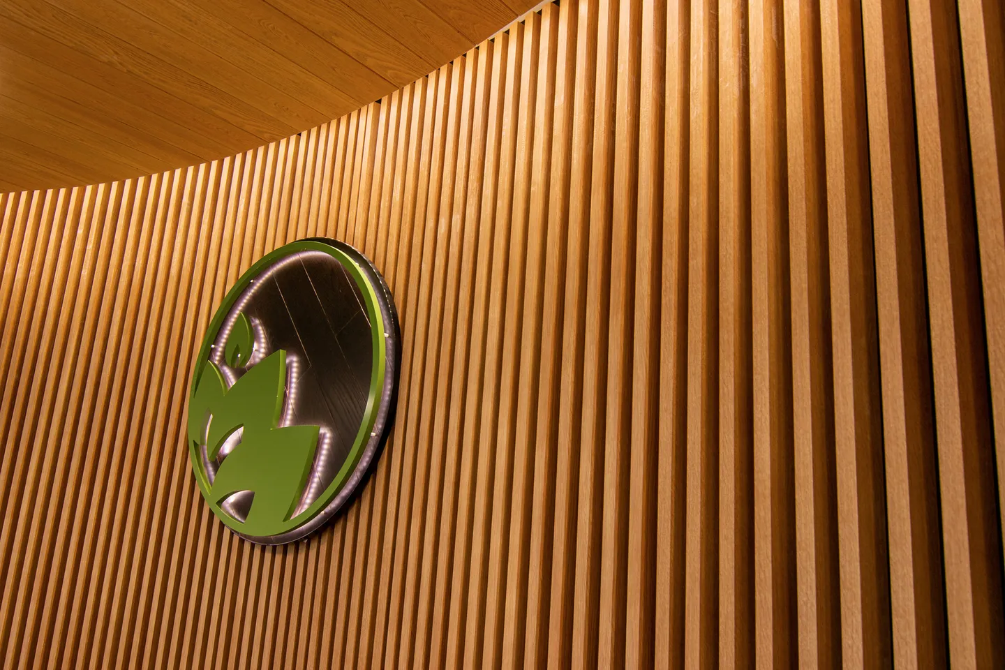
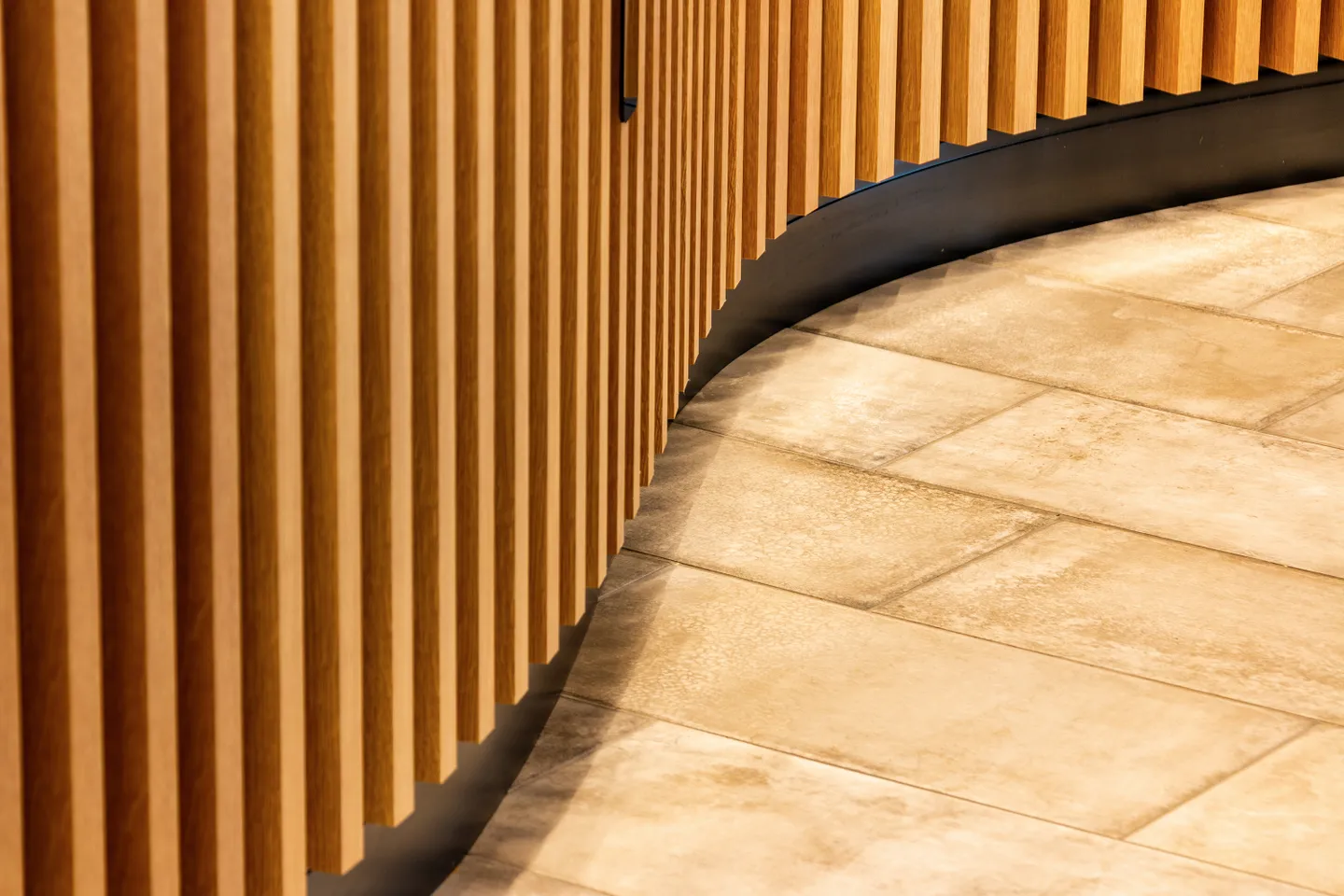
The team used B+N Industries’ Fortina louvers in an oak finish to cover the undulating walls that separate smaller, specialized rooms from the main salesfloor. They also set digital infographic displays in between the louvers for customer use. The result is a space that feels more like a spa or a high-end boutique than a headshop or dealer’s den.
